What a good jewelry render looks like: a 10-point checklist
By HeyGema™ · Updated · 4 min read
In short
A good jewelry render matches your CAD exactly, shows metal that reflects bright and dark areas, diamonds with dark and bright facets, clean prongs, a soft contact shadow and a clear angle. Check these ten things before you send a render to a client.
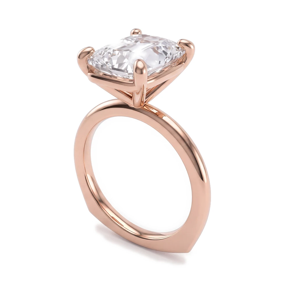
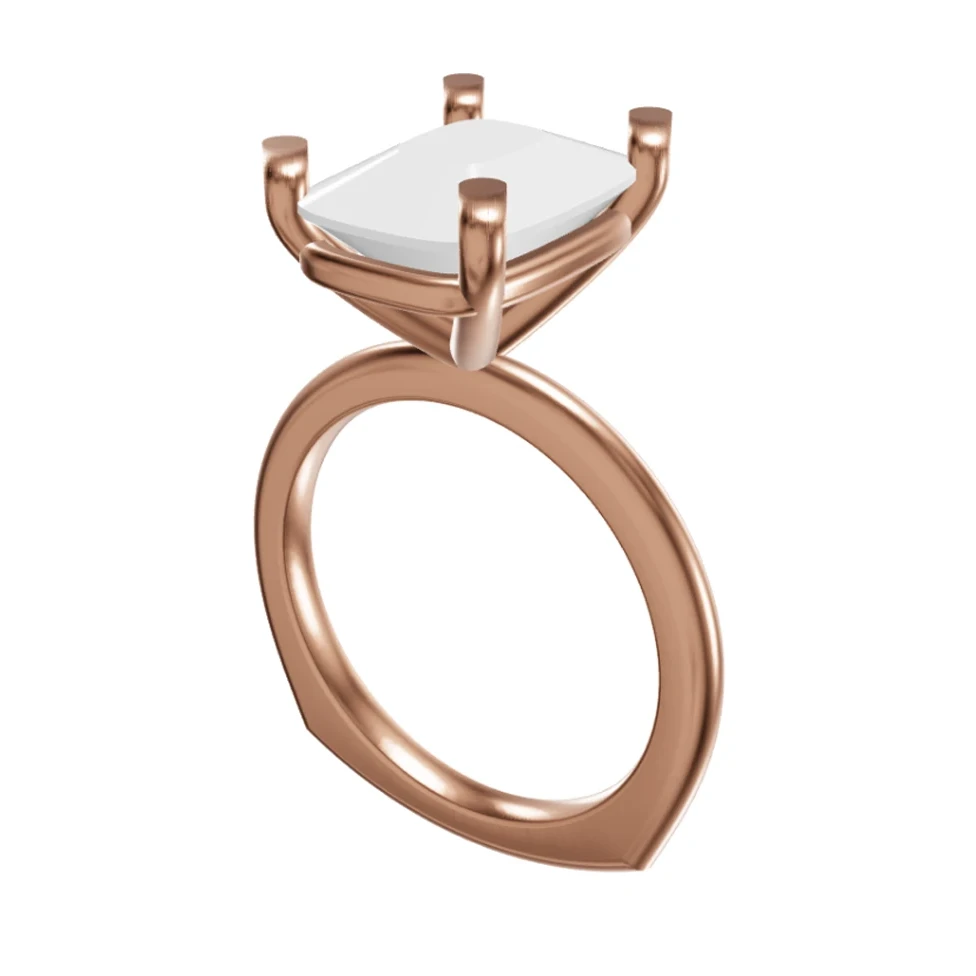
A jewelry render goes to a client, a casting house or your web store, so it has to be right. Most bad renders fail in the same few places. Here are ten things to check before you send one. If you are new to the topic, start with the complete guide to jewelry rendering.
The ten checks
- 1
It matches the CAD
Same number of prongs, same band width, same stone sizes and positions. A render that looks nice but changes the design is a wrong render.
- 2
The metal reflects something
Polished gold shows bright highlights next to dark areas. A flat, evenly colored band means the lighting is missing contrast. See jewelry render lighting.
- 3
The metal color is the one you quote
Yellow, white and rose gold should look like themselves, not tinted by the background.
- 4
Diamonds have dark and bright facets
A stone that is all white looks like plastic or frosted glass. See how to make diamonds look real.
- 5
Prongs are clean
Each prong has a clear shape and holds the stone. Merged, missing or extra prongs are the first thing a jeweler spots.
- 6
Edges are sharp
Bezels, channels and pavé settings have crisp lines, not soft blurry ones.
- 7
There is a soft contact shadow
The piece sits on the surface instead of floating.
- 8
The angle shows the design
A three-quarter view shows the head, the shank and the profile. Add a side view for settings that sit high.
- 9
The background suits the use
White or light gray for a web store, darker for social posts.
- 10
Nothing is cropped or distorted
The whole piece is in frame, with a natural perspective.
The fastest way to find the problem
Put the render next to your CAD view and compare them at the same size. Count the prongs, the stones and the lines of the band. Then zoom into the stones and the shank. Most problems show up in the first minute.
What a bad render usually gets wrong
- Flat gold and white diamonds. The scene is lit evenly.
- Changed design. A prong added, a stone moved, a band made thicker.
- Floating piece. No shadow under it.
- Wrong metal color. White gold that turns blue, or yellow gold that turns orange.
Checking in HeyGema™
HeyGema™ renders from your CAD file or a screenshot, so the design stays as you drew it. If something is off, such as a prong style or a stone shade, change it and render again. The original stays as it was, so you can compare the two.